Don’t hestitate to get in touch if you have a question or need more information!
Thank you! Your submission has been received!
Oops! Something went wrong while submitting the form :(
Virginia Highlands
Atlanta, Georgia
USA


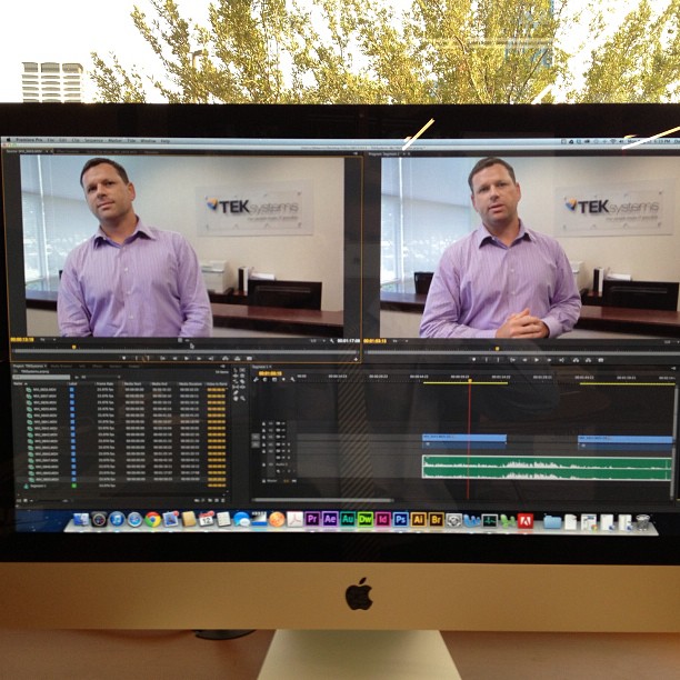
During my time as Communication Director at the JAX Chamber I provided public relations, marketing and digital strategy. I planned, filmed, edited and published the following videos.
Videos were shot on a Canon 60D DSLR and edited using Adobe Premier Pro. Intro graphics were created in Adobe After Effects. Editing took place over three to four days while managing day-to-day public relations and marketing needs.
Our primary contact at Brightwhistle was front end developer Elizabeth Korthof. After our first interview we were given access to a demo environment of the companies marketing platform along with a client level permissions set. The company is developer led and operates on a lean agile process. As a result design documentation was limited to what we could glean from the demo environment.
We also met with Stephanie Daigle, Client Services lead. She discussed her team, client interactions and overall needs. We learned:

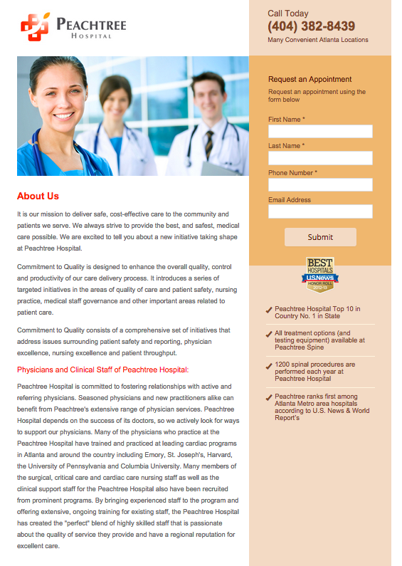
Brightwhistle makes it possible for healthcare providers to communicate directly to health care consumers using Personal Health Information (PHI). Its HIPPA certified database connects to its customer relationship management (CRM) platform.
Unlike many other CRM companies a majority of lead generation functions are conducted by an in-house client services team. After being acquired an emphasis was put on increasing self-service use of the lead generation platform.
Landing pages are an important part of the lead generation platform. Information is collected through embedded forms and sent to the Brightwhistle database. Depending on the needs of the client, interested customers can be contacted over the phone, through email or on social media.
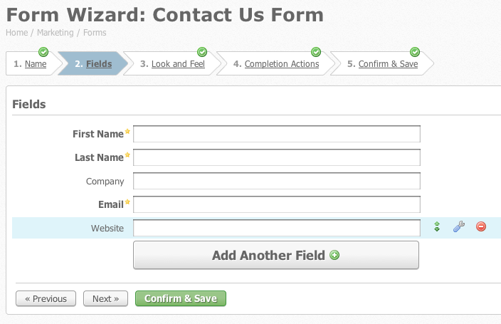
Pardot is an integrated CRM platform owned by industry giant Salesforce. While its parent company focuses on large corporations, Pardot is targeted at small to medium sized businesses.
Pardot uses a “wizard” interface in its form builder. This setup assistants presents users with a sequence of dialog boxes that lead them through a series of predefined steps. Users can choose and edit form fields, preview and save completed forms for use on landing pages.
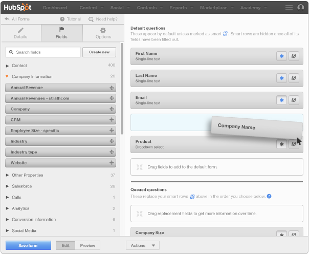
HubSpot is an integrated lead generation and marketing suite. The platform emphasizes “inbound marketing,” where companies create desirable content to attract customers.
Landing page generation is a major element of lead generation within HubSpot. Page layout, editing and form building are nested together. The platform emphasizes intuitive interaction through a drag & drop “what you see is what you get” (WYSIWYG) interface. Common field types like address blocks are formatted by default, but custom fields can be created as necessary.
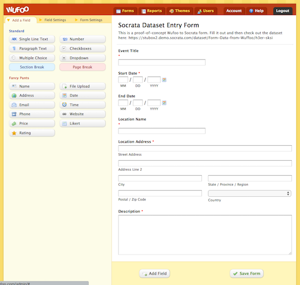
SurveyMonkey purchased Wufoo in 2011, but both brands continue to exist. Wufoo is a more consumer focused brand, while SurveyMonkey offers more advanced features at a higher price. Both platforms offer a wysiwyg form editor in addition to powerful analytical tools. The Surveymonkey Platinum plan advertises HIPAA compliant features.
The Wufoo interface follows a WYSIWYG convention with live previews of the form as you create and edit it. The interface is deceivingly advanced employing plain language terminology and help icons throughout. Preformatted field types are available by default.
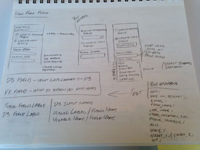
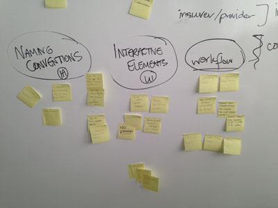
Analysis was conducted using Jacob Nielsen’s 10 principles for interaction design before interviewing users. Our initial assessment identified a number of trouble areas. Information architecture elements such as information hierarchy, ontology and error states need improvement and some interactions caused confusion. These findings formed a foundation for our user testing plan.


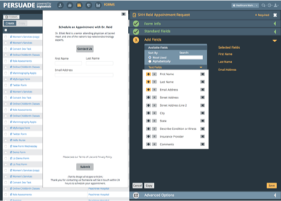
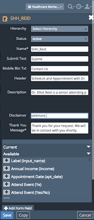
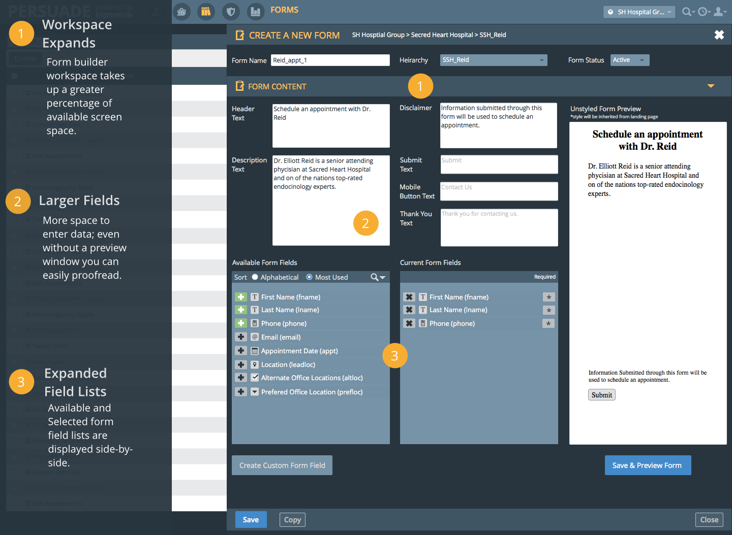
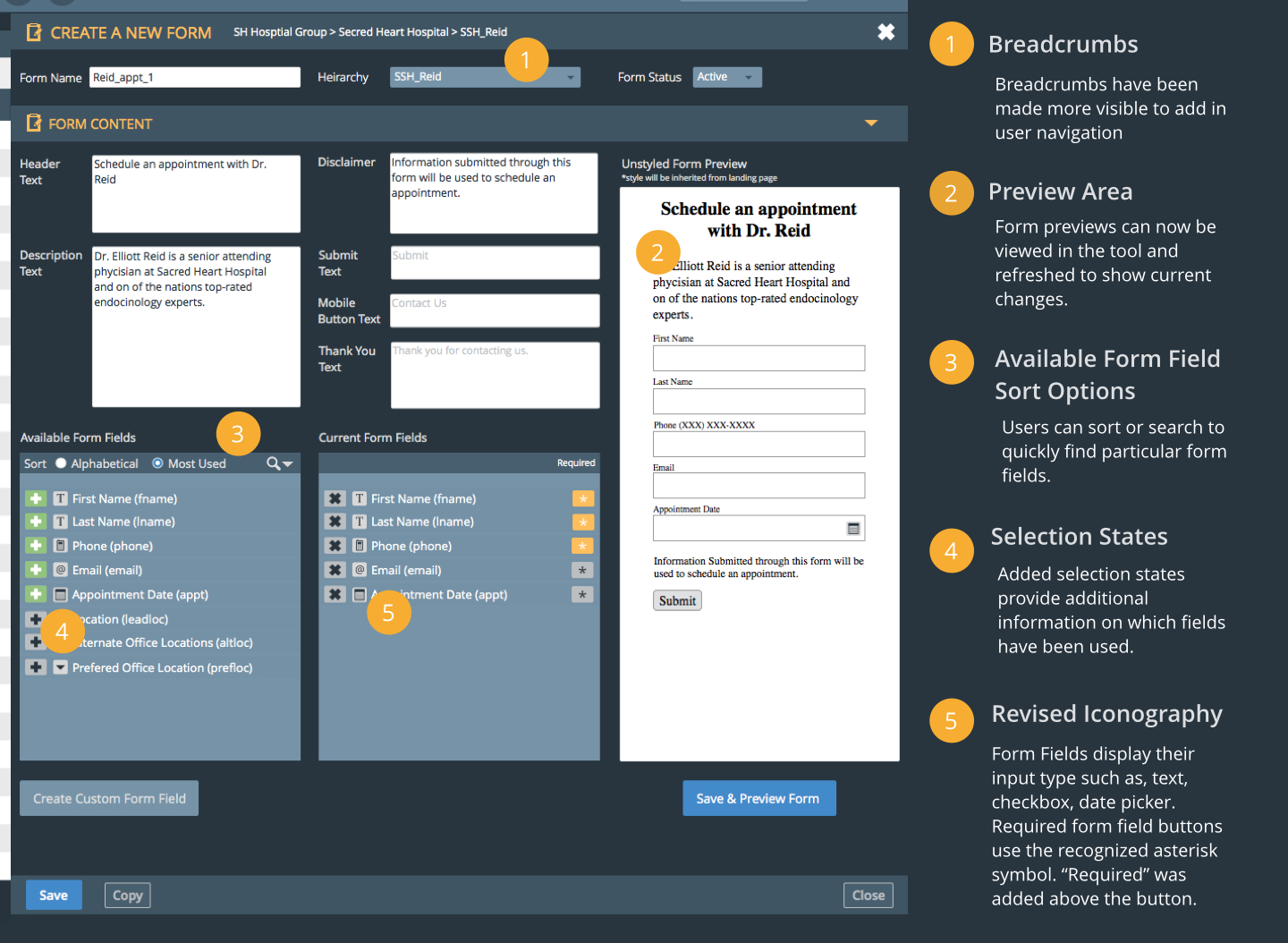
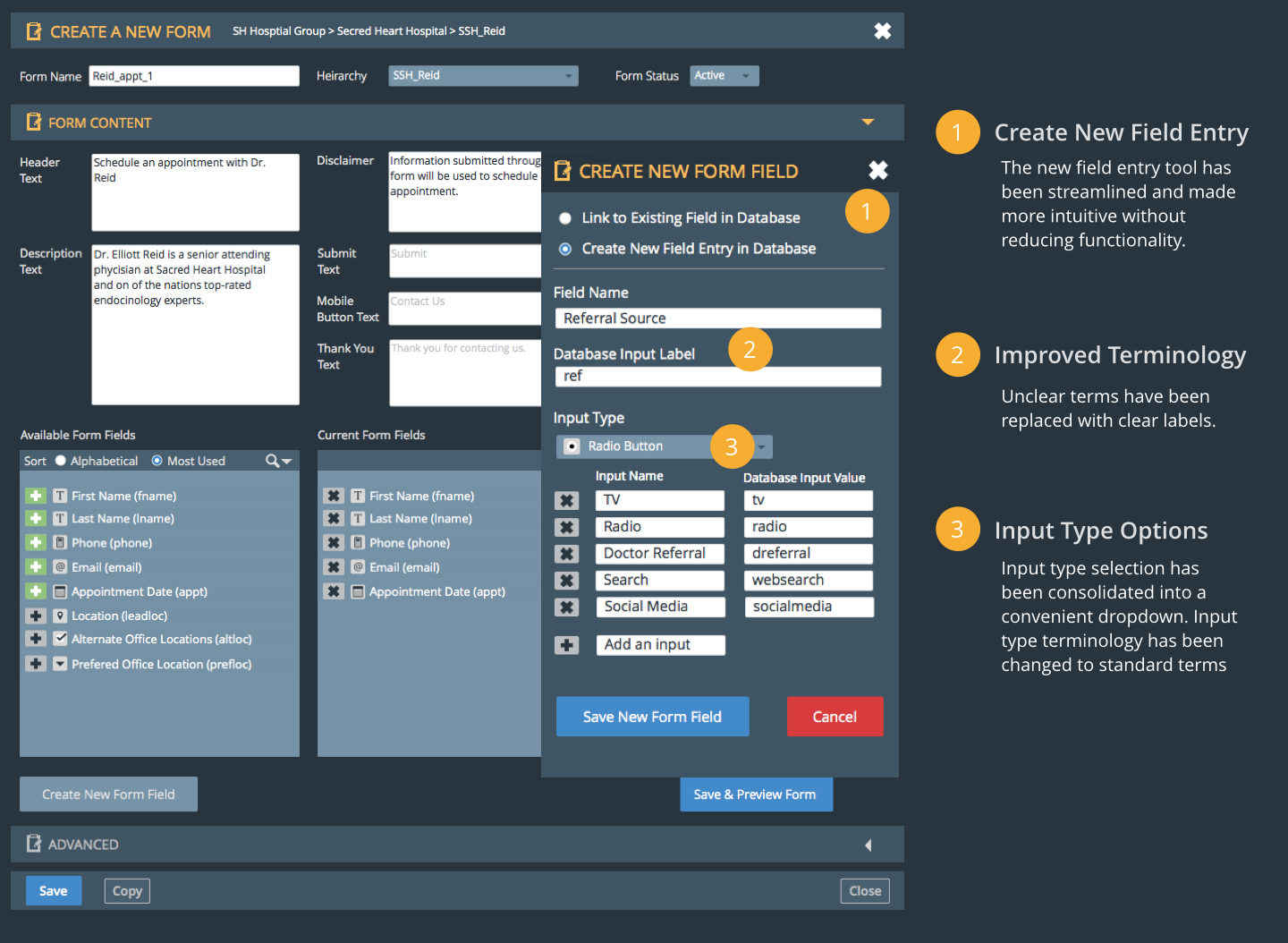
The tool uses breadcrumbs to show what business unit forms are being created for, but could be easier to see. Slide out panels can become obscured without explanation when sub-tools are activated.
Access was defined by two user classes, but complimentary functions were at times cut off from lower status users. For example form field creation is accessible to all users, but their editing and deletion after the field has been created is limited to administrators.
Error states are present at some points, but are inconsistent. When a user attempts to exit without saving there is a flagging message confirming the action, but it does not always show up where the error took place. Some flagging messages display unclear error codes without context or explanation.
With the exception of field editing and deletion all users had access to all areas of the form builder. Advanced and infrequently used features like data mapping were accessible without any resources to explain their use. Users must exit the form builder to preview their work.
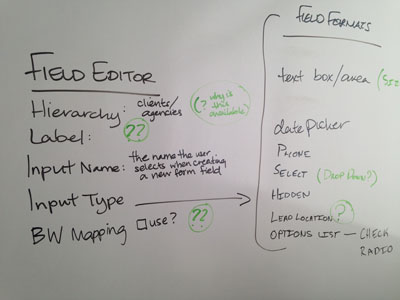
System oriented functions used vague or overly technical terminology. In the case of the form field creation tool, terms to identify what the field would be labeled in the database and for the end user where confusing.
Input methods for form fields that require the selection of a predefined options (dropdown menus, radio buttons, check boxes) are not indicated.
The interface is compact to a fault. Three quarters of the screen are unused without reason. As a result form field selection boxes are stacked making selection difficult on small screens. The form field creation tool slides over the form builder obscuring the entire panel.
Access to help menus, hints and documentation are absent.

“Hmm, that is a little wonky.
I didn’t notice.”
User Level: Administrator
Technological Comfort: High
Technological Capability: High
New Skill Acquisition: Moderate
New Skill Retention: High
Learning Style: Auditory, Read/Write.
Ellie’s a Client Services Administrator at a healthcare marketing company. She started with the company shortly after its inception two years ago, leaving a position on the Marketing and Communications team at a hospital. She has a degree in Communications and New Media, and because of her background has particular familiarity with the healthcare industry.
Ellie’s been with the company long enough to know the software’s quirks. She is accustomed to the parts that are harder to use, and has figured out ways to work around them that are now so habitual she doesn’t even notice them.

“Brace yourself:
New fields are coming.”
User Type: Administrator, Client
Technological Comfort: High
Technological Capability: Moderate
New Skill Acquisition: Rapid
New Skill Retention: High
Learning Style: Tactile/Kinesthetic
Ned is a millennial and grew up on the internet. He enjoys technology and learned most of what he knows by breaking things and then fixing them. This means he has a tendency to shoot first and ask questions later when it comes to using technology.
Ned is a junior member of a hospital marketing team. He works on an iMac and uses Photoshop and InDesign for design work. He also maintains the organization's social media and accesses email through the browser. The most complex online user interface he uses is a CMS similar to Wordpress. He received no training in how to manage this CMS, but figured it out on his own.

“Technology isn’t always my cup of tea, so I hire people for whom it is.”
User Level: Client
Technological Comfort: Low
Technological Capability: Moderate
New Skill Acquisition: Slow
New Skill Retention: Moderate
Learning Style: Visual
Vicky is a baby boomer who worked her way up the corporate ladder. She respects what technology can do, but avoids using anything that he is uncomfortable with. This means that she limits her use of technology to the Microsoft Office suite, her Blackberry and Internet Explorer.
Vicky is the Vice President of Public Relations and Marketing for a hospital chain. The majority of her day is spent in meetings and on the phone. Despite her status, she is known to periodically take on lower-level projects. She believes it is important for her staff to know she can still handle daily PR and marketing tasks. Vicky works on a desktop PC and attends training when she must learn something new.
We planned and completed three stages of testing; baseline, prototype one and prototype two. At least five users were performed per stage. Before testing users were classified according to their persona fit.
All users were tested using the same pre-established script. I guided a majority of the testing sessions while Kendra observed and took notes. In each case we recorded the user screens and audio. When possible we recorded the user’s facial expressions.
The testing script led users through a scenario where they have been asked to create a new form without any instruction. Users were asked to talk through their process, mentioning how they felt along the way. Help was only offered if the user had hit a dead end they could not recover from. Neutral language was chosen to avoid biasing user decisions and opinions.
We tested seven users to uncover major and minor pain points in the existing form builder. We classified results based on user type and permissions level. Many of issues we discovered during our heuristic analysis cause problems for both new and experienced users. Issues ranged from small inconveniences to significant usability problems. Reactions were at best indifferent and at worst utter frustration.
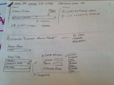
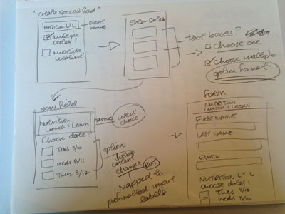
While these issues were primarily concerned with usability, we also uncovered a scenario where untrained or malicious users could harm data integrity. Database field mapping was possible through the “New form field” sub tool. The option is used in advanced scenarios where a second database has been connected to Brightwhistle forms.
Users that fit the Ned persona were unsure of the mapping function’s use, so they created fields to try figure it out. Since the mapping function sent inputs from the new form field to whatever database field it was mapped to, bad inputs could begin polluting overall data integrity.
With initial discovery complete we assessed the problem. We knew our constraints would not allow for a complete redesign. Testing proved that while sometimes frustrating, the tool worked as it needed with some exceptions.
As a result we focused our efforts on adjusting the tool’s information architecture to do the following:
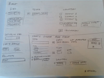


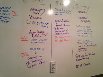
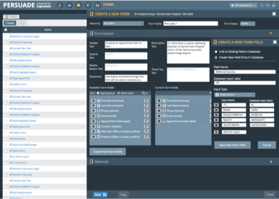
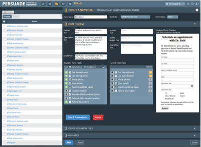
Development constraints limited how far we could redesign the form builder’s interface, but we wanted to see to what extent this was true. To get this information we began by designing two different form builder interfaces. Kendra developed a wizard like interface with real time previews and feedback. My changes were more conservative with a focus on improving information hierarchy, iconography and ontology.
New users prefered Kendra’s wizard based interface, but found my conservative prototype a significant improvement. Admin users liked the feedback elements in her prototype, but prefered the organization and iconography of my interface. Stakeholders pointed out development issues and suggested adjustments.
After receiving feedback on our first prototypes we merged the ideas and iterated on features and interaction. Development requirements meant some aspects of the initial prototypes had to be revisited. Functionality like field flagging was dropped and the slide out “new form field” sub tool panel was incorporated into a tab interface.
Second round testing further refined the interface. New users made it through their prompt without issue. Administrative users loved the interface with the exception of the tabbed “new form field.” The sub-tools existing interaction was fine for administrative workflows, but new users were confused by the stacked panel metafore. During testing we came across a novel approach to the “new form field issue,” pre formatted custom field options.
Early user flows were made needlessly complex by the “new form field” mapping issue. Once we came upon the pre formatted custom field solution our user flows fell into place The following user flows show how tasks are completed for both admin and client level user groups.
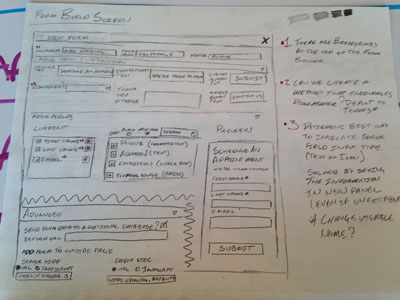
All users need access to three fundamental tools within the form builder; adding top level information, descriptive form information and form fields.
Admin level users need access advanced features like new form field creation and code snippets. Client level users only need to customize specific types of fields like location and date options.
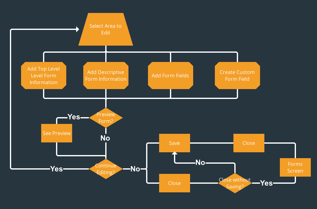
Click image to view user flows
The JAX Chamber leadership trip is the most important business event of the year. Jacksonville's public, private and nonprofit leaders spend a week learning about and initiatives taking place in other cities. Projects including the Jacksonville Riverwalk, Jacksonville Sports Council and the Downtown Development Authority are all products of these trips.
Jacksonville Florida has a strong IT industry. JAX Chamber President Daniel Davis wanted to feature some of the outstanding small to large businesses that had based themselves in the city.
Advanced manufacturing is a growing sector in Northeast Florida. This video featured JAX Chamber members that were making a difference in the field.
Brightwhistle’s form builder is a purpose built to work within the existing lead generation platform. Since the platform segments tasks like landing page creation, the form builder was fine existing as an independent tool.
Our design recognizes this reality while setting a firm foundation for future development. As the lead generation platform evolves the form builder tool can be integrated into any number of workflows.
Adjustments to existing interaction patterns, like the floated slide over “form field creation” tool, make usage more intuitive. Information architecture adjustments avoided drastic design pattern changes, reducing development time.
Our final product improves upon the existing tool and defines a more usable design president going forward. Both administrative and client level benefit from error reduction and a clearer workflow.

Lorem ipsum dolor sit amet, consectetur adipiscing elit. Suspendisse varius enim in.
Lorem ipsum dolor sit amet, consectetur adipiscing elit. Suspendisse varius enim in.
Lorem ipsum dolor sit amet, consectetur adipiscing elit. Suspendisse varius enim in.
Lorem ipsum dolor sit amet, consectetur adipiscing elit. Suspendisse varius enim in.
Need more information?
Get in touch!
Lorem ipsum dolor sit amet, consectetur adipiscing elit. Suspendisse varius enim in eros elementum tristique. Lorem ipsum dolor sit amet, consectetur adipiscing elit.
Lorem ipsum dolor sit amet, consectetur adipiscing elit. Suspendisse varius enim in eros elementum tristique.
Lorem ipsum dolor sit amet consectetur. More info ›
20 commodo diam
Libero vitae
Lorem ipsum dolor sit
Aenean facibus nib
Lorem imperdiet
50 commodo diam
Libero vitae
Lorem ipsum dolor sit
Aenean facibus nib
Lorem imperdiet
99 commodo diam
Libero vitae
Lorem ipsum dolor sit
Aenean facibus nib
Lorem imperdiet
Lorem ipsum dolor sit amet adispcing elit viveraa ornare. More info ›